Key takeaways
Style links, buttons and navigation consistently, so that they are recognised as the same kind of thing.
Make interactive elements look different from ordinary text.
Origins
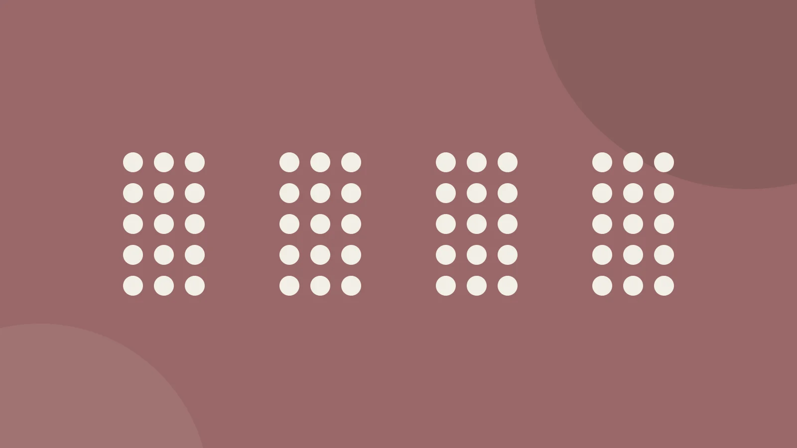
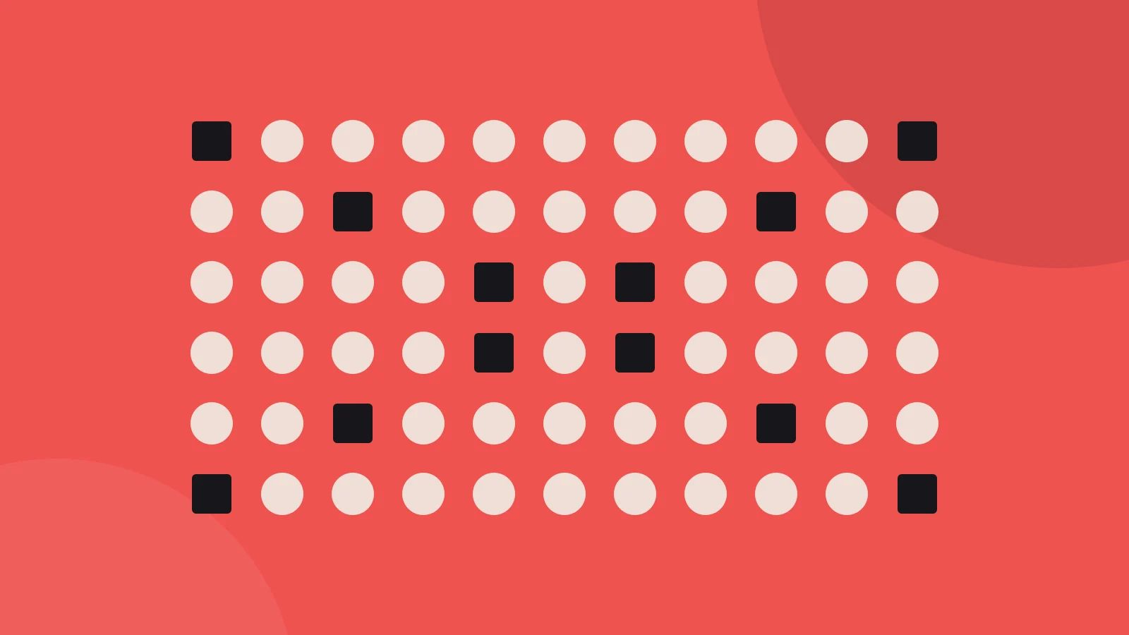
Similarity is another of the Gestalt grouping principles. A shared colour, shape, size or texture makes elements read as one group, strongly enough to outweigh a little distance between them. Max Wertheimer described it in 1923, in his study of how we organise visual patterns.
In practice
- Give everything clickable one consistent treatment, and give nothing else that treatment.
- Use colour to code categories and keep to the code on every screen.
- Break the similarity on purpose to make one element stand out.
Further reading
- The Law of Similarity - Gestalt Principles — Interaction Deisgn Foundation | Mads Soegaard
- Design Principles: Visual Perception And The Principles Of Gestalt — Steven Bradley | Smashing Magazine
- Law of Similarity on Laws of UX — Jon Yablonski
The illustration is our own, drawn after the idea of this law’s card in Laws of UX by Jon Yablonski.