
Key takeaways
The eye looks for order and simplicity in complex shapes, so that it isn’t overwhelmed.
Keep forms, layouts and icons as simple as the message allows.
Origins
“Prägnanz” is German for conciseness or good form, and the law is the foundation of Gestalt psychology. Around 1910, Max Wertheimer noticed lights flashing in sequence at a railway crossing, which the eye reads as a single light moving along. This led him and his colleagues Kurt Koffka and Wolfgang Köhler to a set of principles about how we organise what we see. Prägnanz says that we perceive the simplest and most stable organisation available.
In practice
- Build logos, icons and layouts from basic shapes, which viewers resolve instantly.
- Remove decoration that adds complexity without adding meaning.
- Check ambiguous graphics at a glance: if people see something other than you meant, simplify.
Further reading
- Design Principles: Visual Perception And The Principles Of Gestalt — Steven Bradley | Smashing Magazine
- The Laws of Figure/Ground, Prägnanz, Closure, and Common Fate — Mads Soegaard | Interation Design Foundation
- Law of Prägnanz on Laws of UX — Jon Yablonski
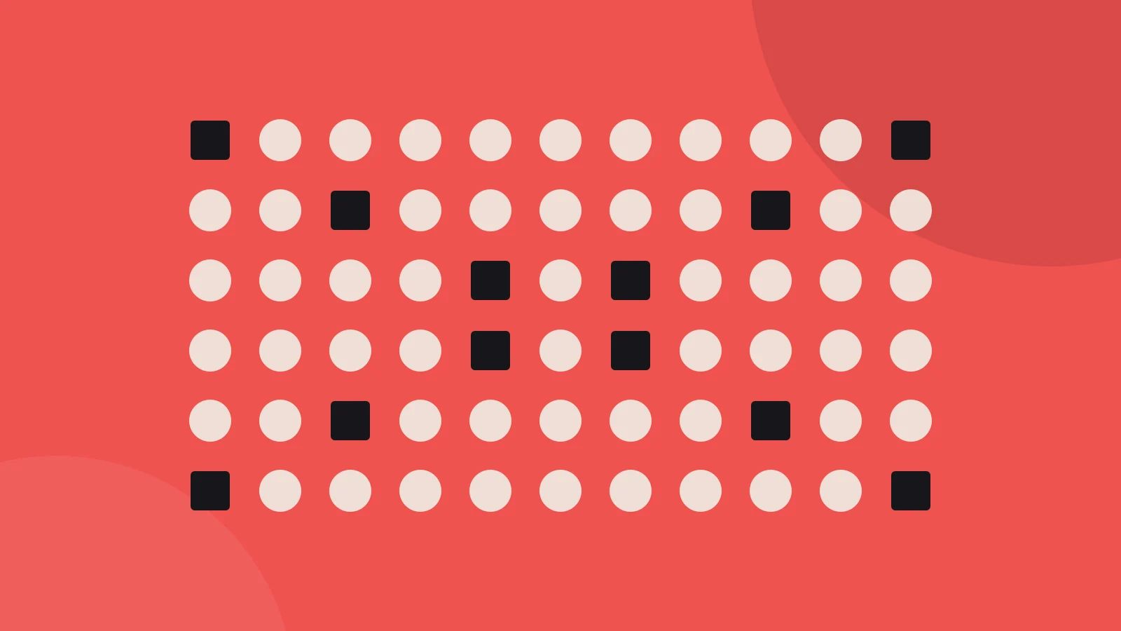
The illustration is our own, drawn after the idea of this law’s card in Laws of UX by Jon Yablonski.